We’ve all judged a book by its cover, a café by its chairs, and yes, a business by its branding. And colour? It’s usually the first thing we notice, even if we don’t realise it. That’s because colour hits us right in the emotions. Fast.
In fact, studies suggest that up to 90% of first impressions about a product or brand are based on colour alone. That’s huge. So, if your brand colours are sending the wrong message, too dull, too loud, or just plain confusing, you could be losing customers before they’ve even read your tagline.
Let’s talk about what your colour choices might be saying behind your back.
Why Colour Matters in Branding
Imagine walking into a spa painted entirely in fire-engine red. You’d probably turn around and walk back out again, right? Red shouts. It doesn’t whisper, “Relax.”
Now picture a children’s toy company using only black, grey and navy blue. Feels a bit… boardroom, doesn’t it?
Colour taps directly into how we feel, which means it has a sneaky superpower when it comes to branding. It helps people understand who you are, what you’re about, and whether you’re for them, all before they’ve clicked a single button or read a word of copy.
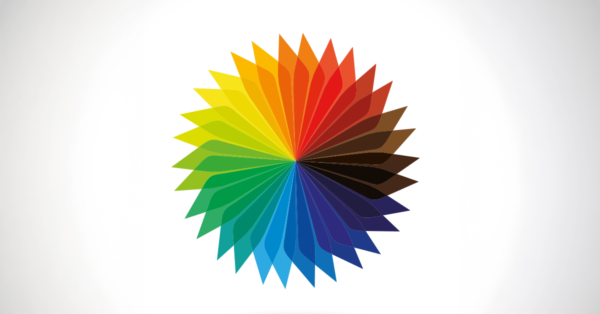
The Colour Cheat Sheet: What Each Shade Says
Here’s a quick peek at what different colours often communicate in branding. Keep in mind, context matters (so does culture), but here are the general vibes:
- Red – Passion, urgency, energy. Great for grabbing attention (hello, SALE signs), but can feel intense if overused.
- Blue – Trust, stability, calm. Used by banks and tech companies who want to say, “You can rely on us.” Also quite safe, maybe too safe if you’re trying to stand out.
- Green – Nature, growth, balance. Perfect for eco-friendly or wellness brands. Also heavily used by health food companies and organic products.
- Yellow – Optimism, warmth, friendliness. But a warning: too much can make people feel anxious. Think sunshine, not warning signs.
- Orange – Confidence, enthusiasm, fun. A bit cheeky, often used by brands that don’t take themselves too seriously.
- Purple – Creativity, luxury, mystery. Historically the colour of royalty. Now more common among beauty brands or those wanting to feel premium.
- Black – Sophistication, elegance, authority. Timeless and bold. Used well, it’s chic. Used badly, it’s just gloomy.
- Pink – Compassion, playfulness, romance. No longer just “girly”, lots of brands use bold pinks to feel energetic and modern.
- Grey – Neutrality, balance, professionalism. Also occasionally: “we didn’t want to choose a colour so we picked this.”
Brand Examples That Nail It
Let’s take a look at a couple of big brands who’ve absolutely nailed their colour strategy:
- Innocent Drinks – Pastel blues, soft greens, pops of cheerful red. Everything about their palette says “fresh,” “natural,” and “not taking ourselves too seriously.” Spot on for a smoothie company that wants to feel friendly and wholesome, with a cheeky wink.
- Harley-Davidson – Black and orange. Power meets rebellion. The black gives you that strong, solid, no-nonsense feel. The orange says, “Yeah, but we’re also a bit wild.” Perfect if you’re selling roaring engines and the open road.
And then there are some brands that go all in with colour as a statement, like Glossier (millennial pink) or Spotify (neon green on black). You might love it or hate it, but you won’t forget it. That’s the point.
What Happens When You Get Colour Wrong?
Picture this: a fun, quirky bakery with delicious cakes… but the branding is navy blue and beige. It looks like a tax advisor.
Or a legal firm trying to inspire confidence but using hot pink and comic sans. Probably not getting the high-end clients they’re after.
The wrong colours create a mismatch between what you want people to feel and what they’re actually feeling. And that creates confusion. And confusion? It’s a conversion killer.
OK, So How Do You Choose the Right Colours?
Here’s the good news: you don’t need a psychology degree or a full brand strategy workshop (although those help!) to start thinking about colours in a smarter way.
Ask yourself:
- What do I want people to feel when they see my brand?
- Am I trying to attract calm people, adventurous people, serious people, or creative types?
- Do my colours reflect that? Or are they saying something else entirely?
If your gut’s telling you something’s off, or if your palette was chosen by a random Canva template five years ago, it’s possibly time for a rethink.
Lastly...
Colour psychology isn’t about rules, it’s about character. You don’t have to tick every box or be boxed into clichés. But if you want your brand to connect, convert, and stick in people’s minds, your colours need to tell the same story you’re telling everywhere else.
Pick a palette that feels like you. One that shows off your personality, connects with your audience, and gives people the right feeling right from the start.
Because in branding, first impressions aren’t just important, they’re colour-coded.